LMX.
MY ROLE
Branding Design
Graphic Design
Product Concept Development
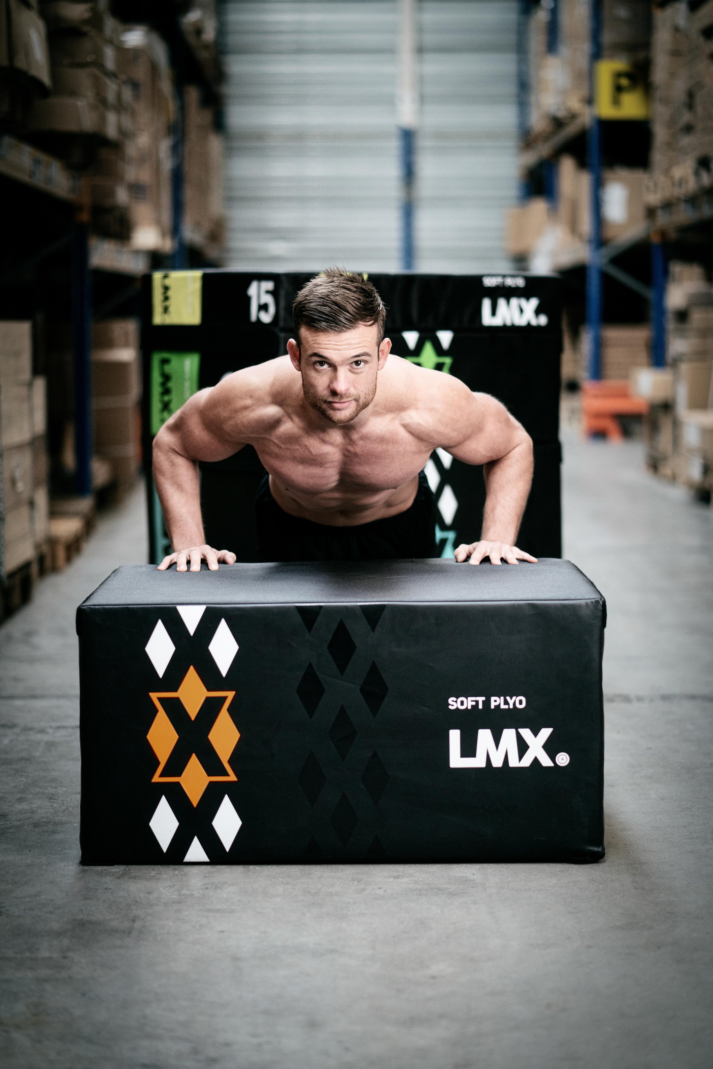
LMX is a brand of Lifemaxx, an internationally oriented fitness equipment supplier based in the Netherlands. LMX offers a wide range of contemporary, fresh looking, high grade equipment: racks, bars, benches, yoga equipment, weights, accessoires and functional fitness equipment.
However, the brand LMX needed its own distinct visual brand identity. I had the lead in redesigning the brand identity, as well as one of LMX's product lines, the body pump disks. This product line needed a complete redesign to fully integrate the new brand identity to engage the users fully.
Make it stand out.
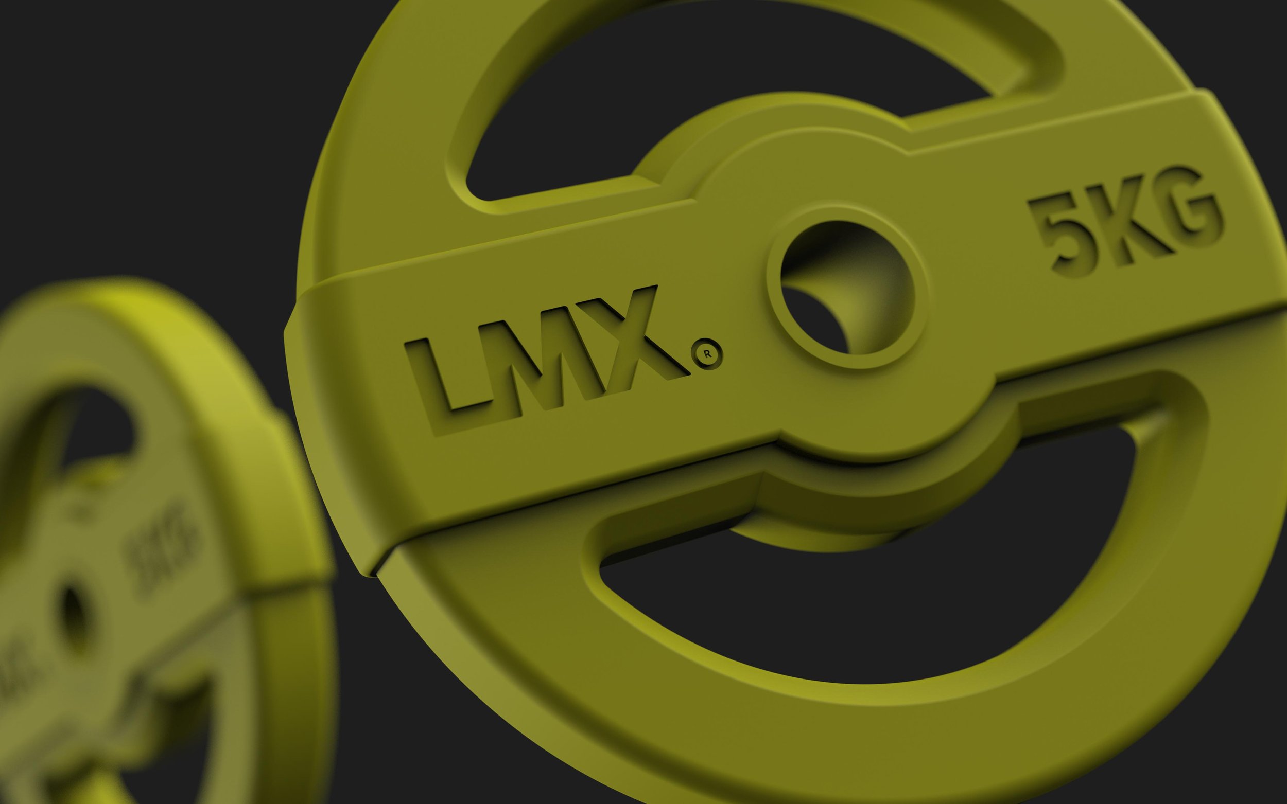
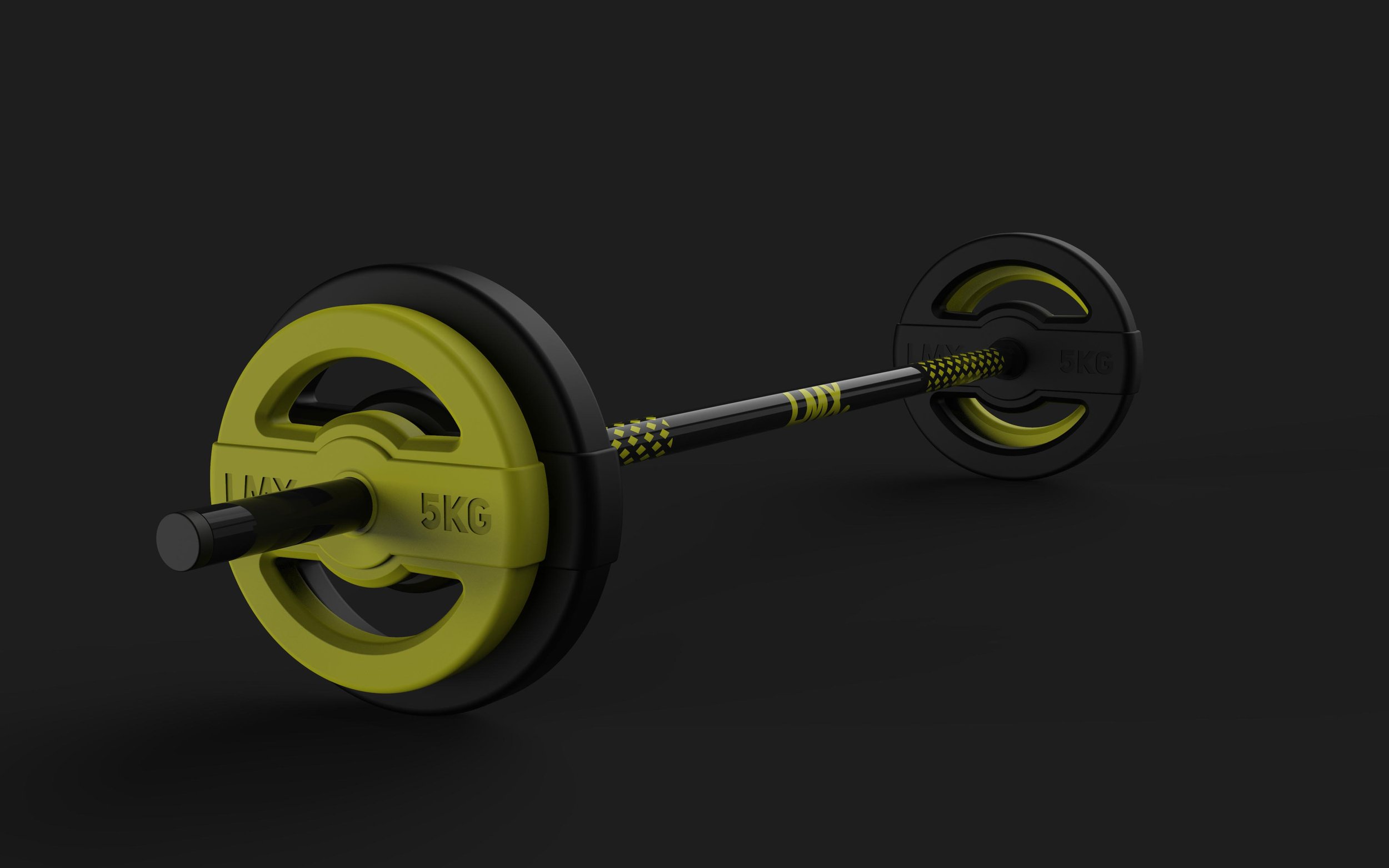
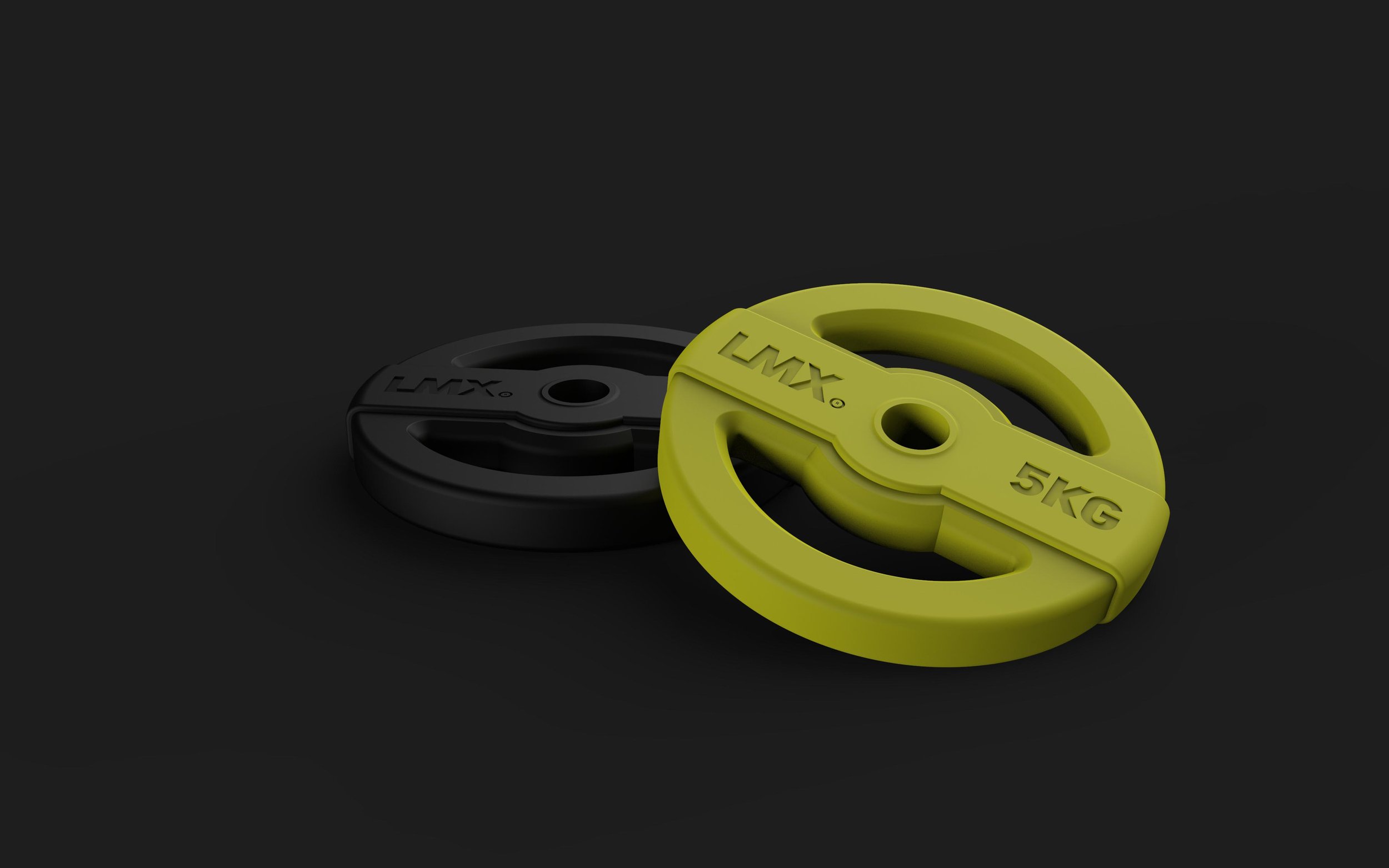
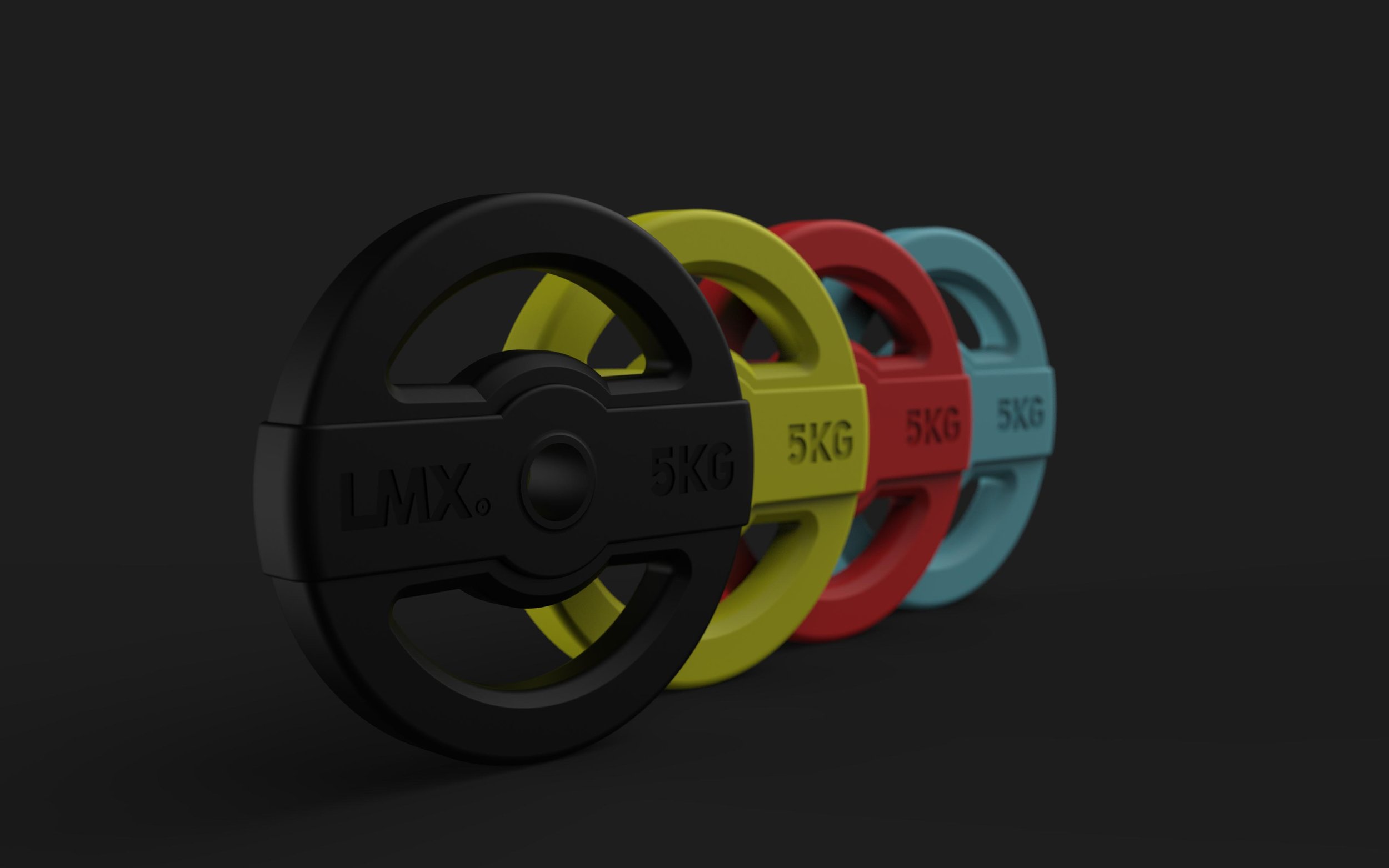
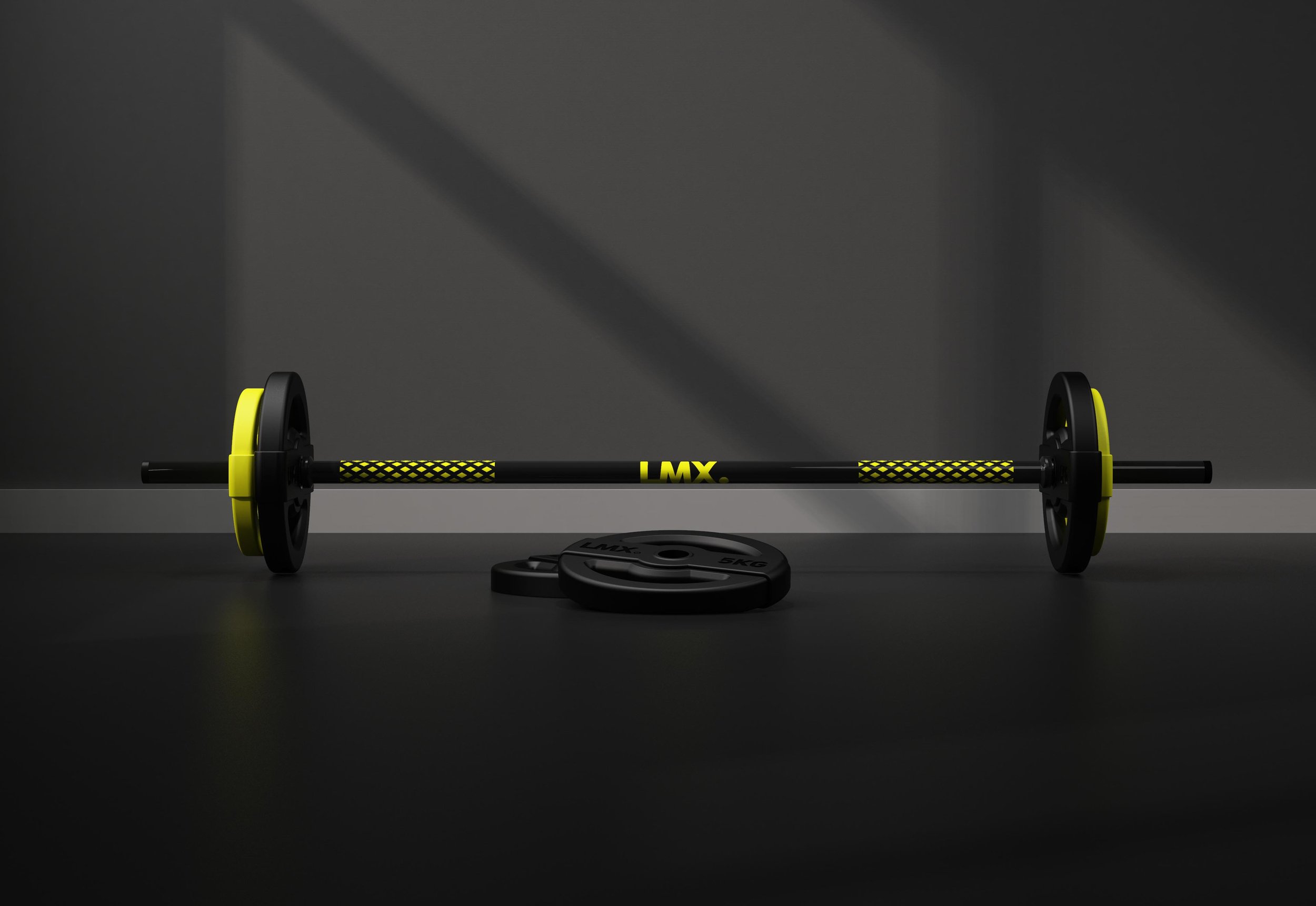
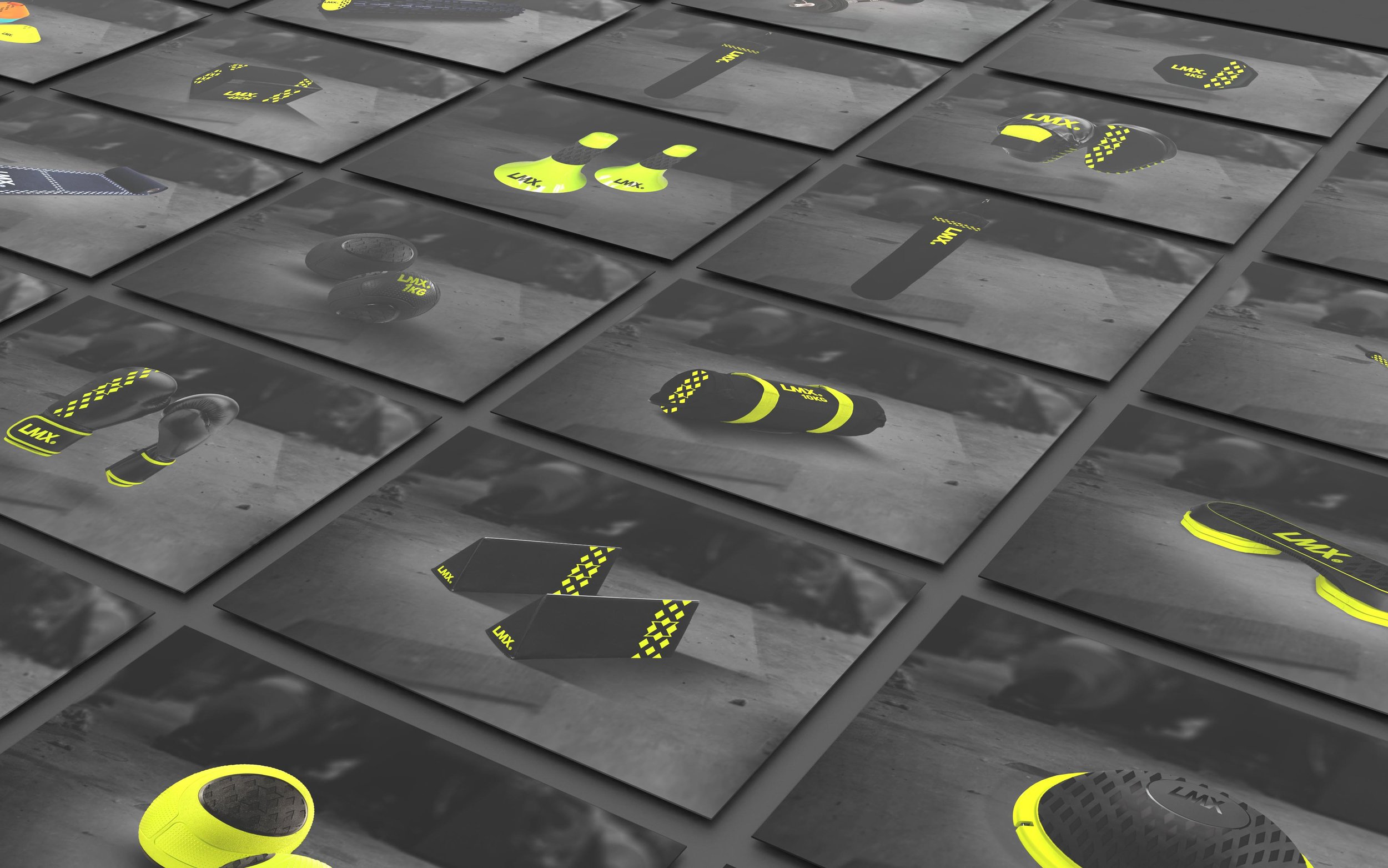
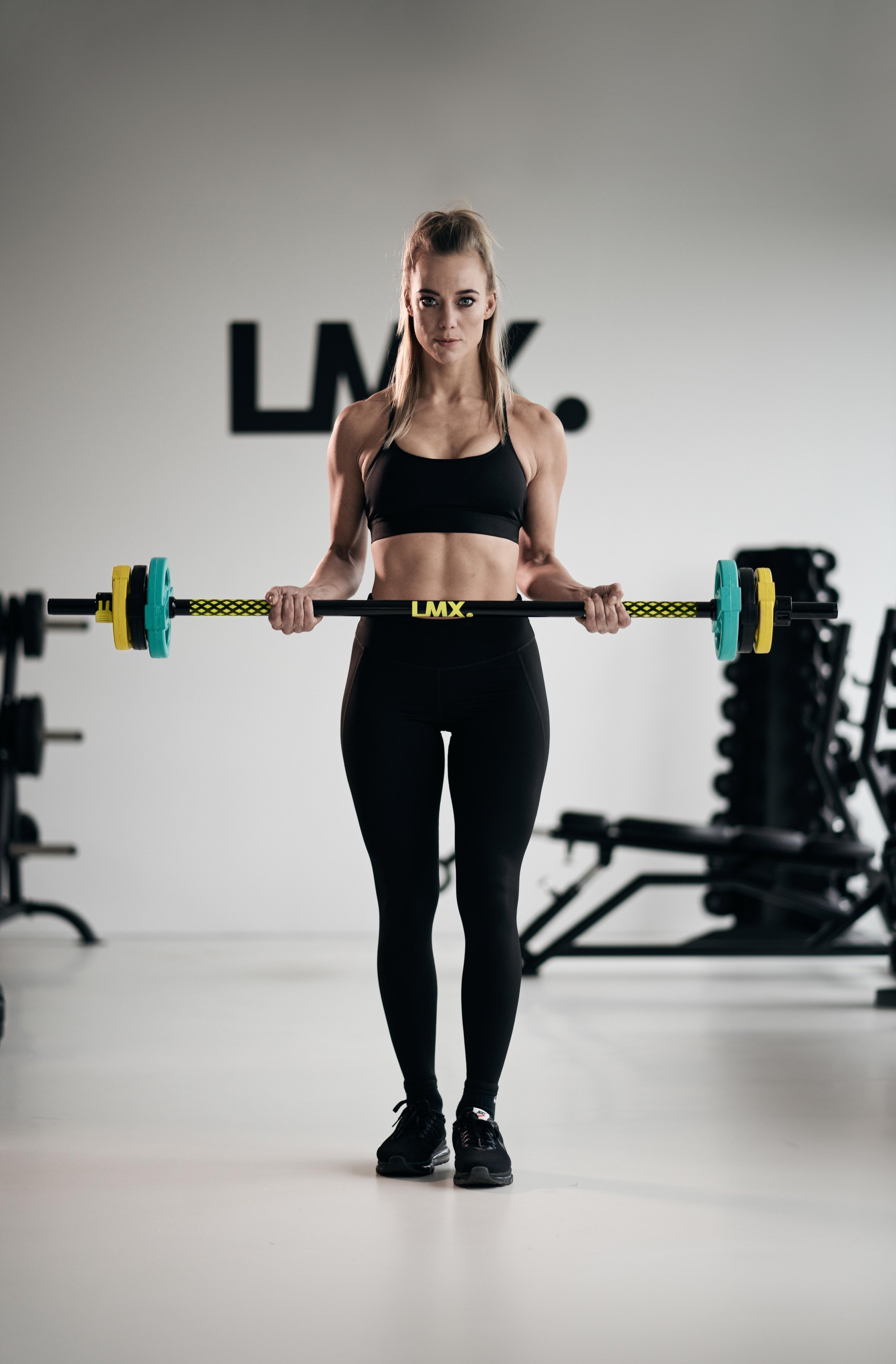
The challenge was to create a distinctive visual identity for LMX which could be applied to all their fitness products. The identity is enhanced using a bold new typography, colours and a recognizable pattern which contains the X's of LMX. Bright colours were used in combination with black which makes the products stand out in the gym. The different bright colours also communicate the weight of the products, which is confirmed by the number presented on them. Users will quickly learn to identify which colour is the right weight for them.
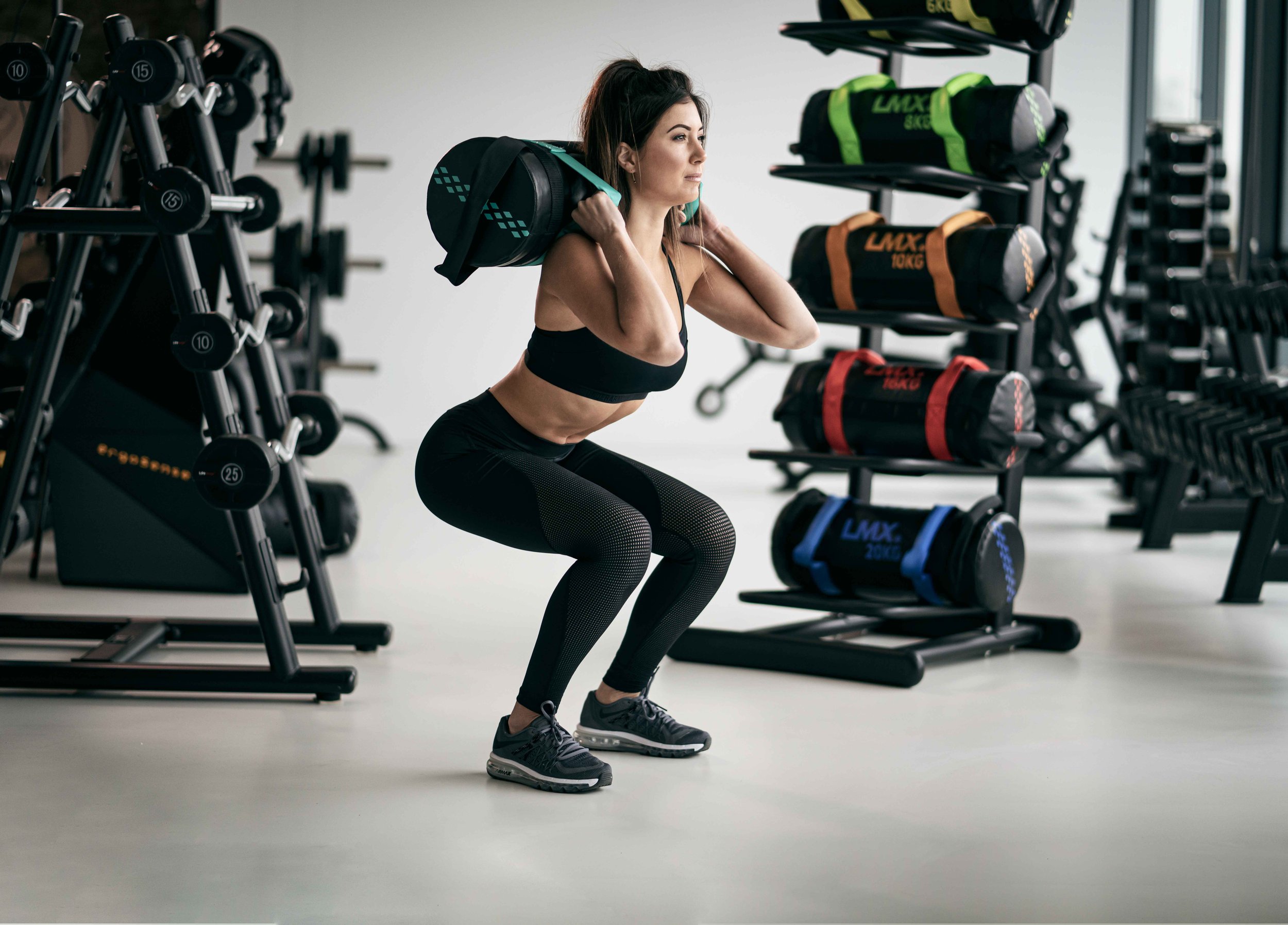
Studio Pump Disc
Next to the visual brand identity, a new design of the studio pump disk has been developed which fits the new brand identity. The bright colours indicate several weights from 1.25 up to 10 KG. The discs are cast iron with rubber coated hand grips, making it possible to perform several different exercises.