
HIGO.
MY ROLE
User research
UI/UX design
Animation design
Prototyping
Testing
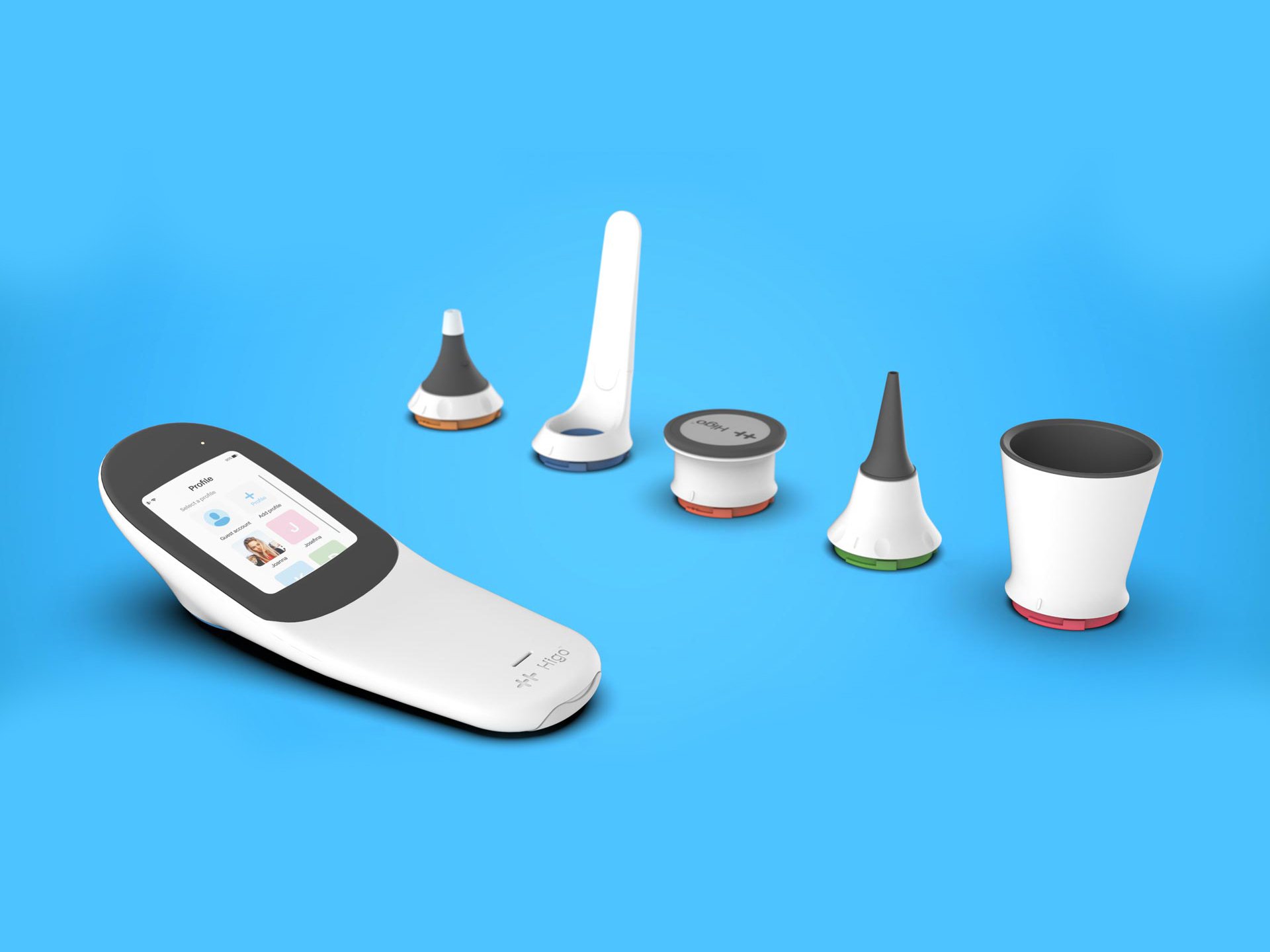
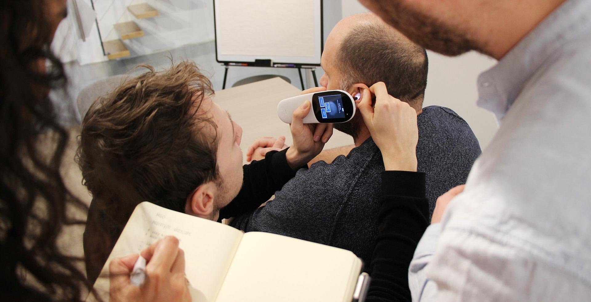
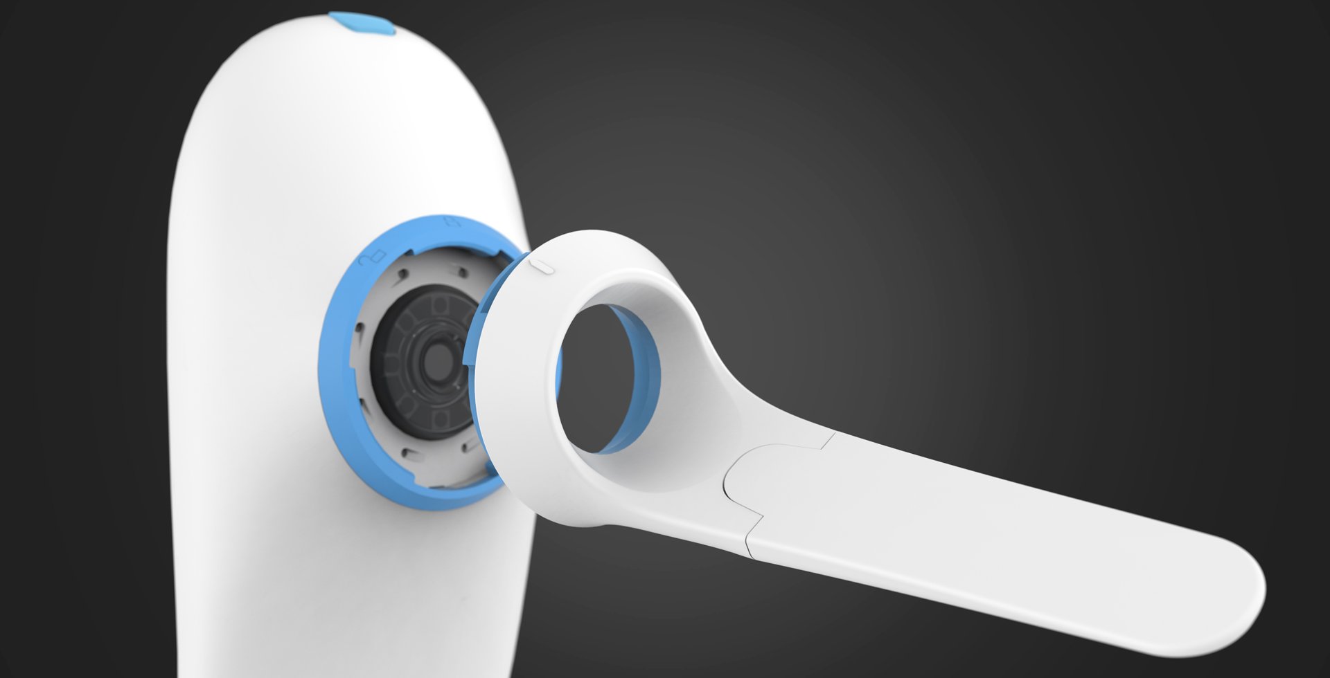
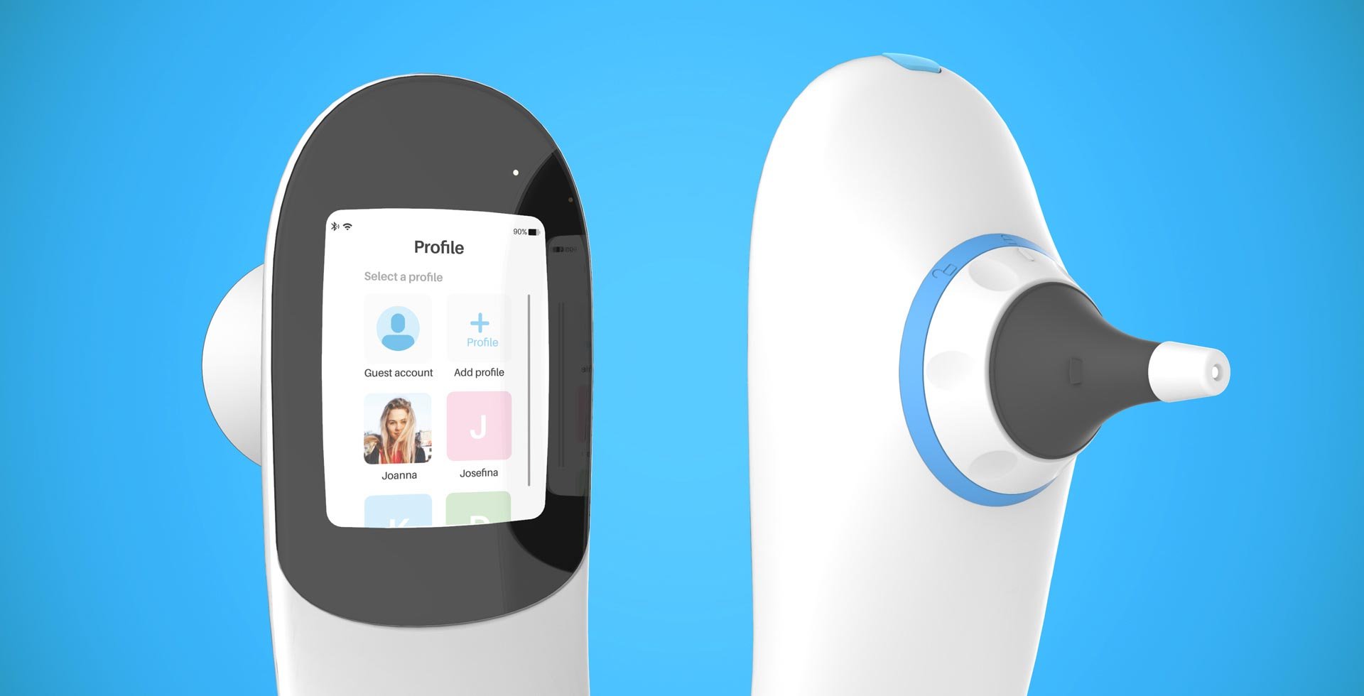
It can be very stressful for parents to have their young child get sick and not know which steps to take. Higo is a telemedical device that allows parents to get a doctor's diagnosis without leaving the house. With 5 exchangeable modules, the user can perform 9 different exams with one device. Users can choose to perform a full examination or one specific exam.
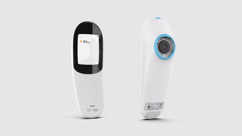
How can we simplify the user's journey so users can perform this examination easily? Together with Higo's team, I created the UIUX-design for the Higo Sense device to guide the user through the entire diagnostic process step by step.

Step by step
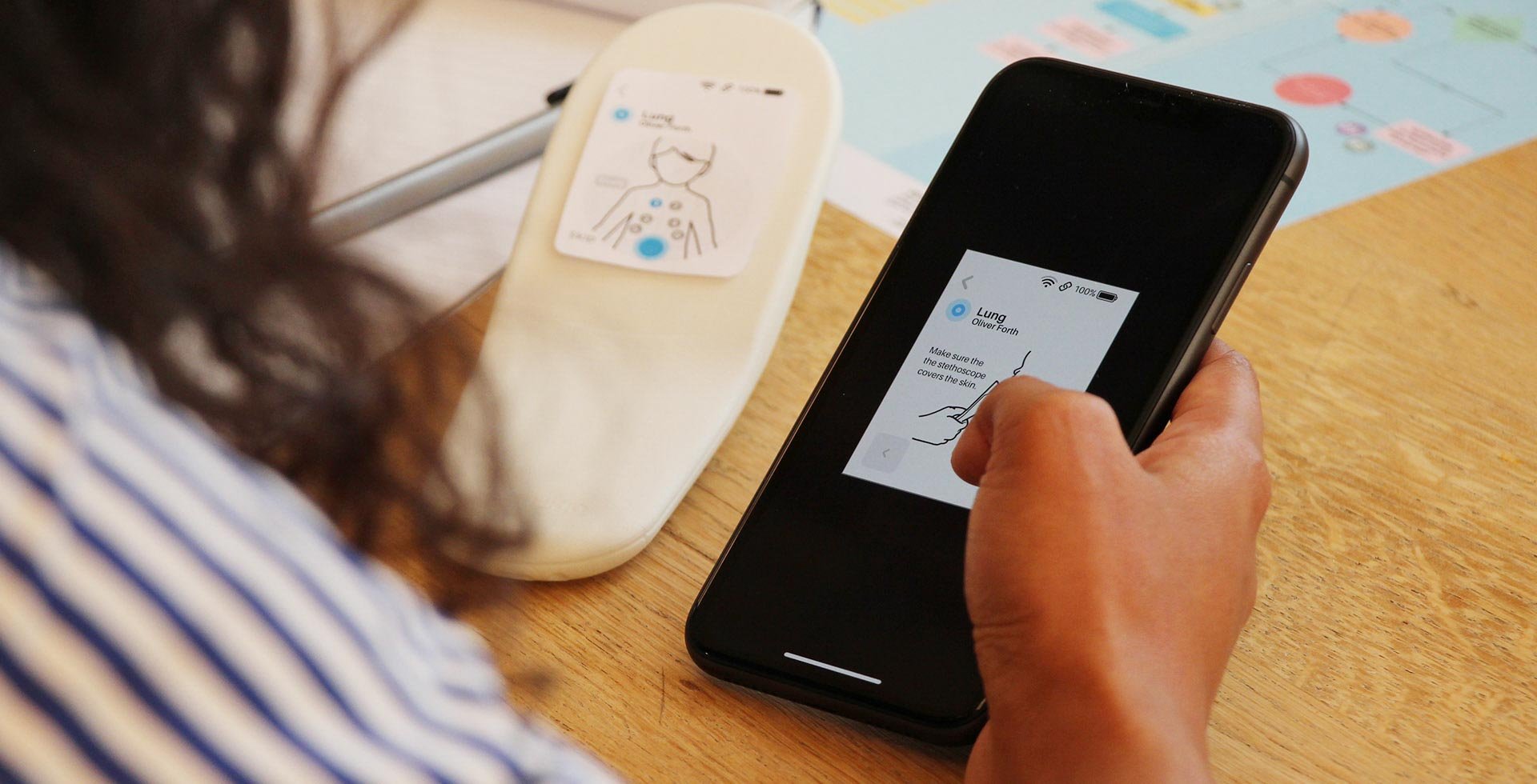
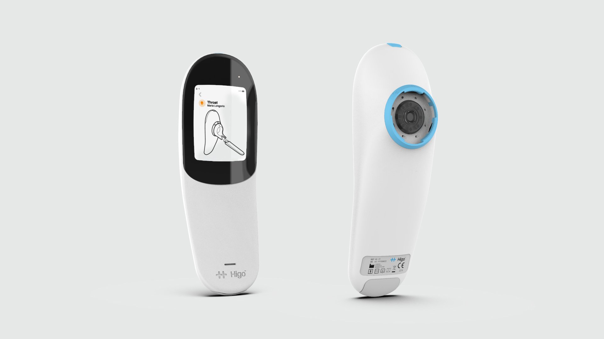
My goal was to comfort the users and explain to them how to use Higo by creating a simple and intuitive user interface. Step by step, users are shown how to perform different exams correctly through animations and graphic design.
The animations and graphic design are minimal, subtle and only show what is essential. The Higo detects and validates each step and gives feedback to the user. After the user has performed the exam, high quality medical-grade data is collected and stored in the Higo app. This allows the user to send the necessary data to a doctor who makes a diagnosis. This data includes photos, audio, video and other measurement data.
Iterate, Iterate, Iterate
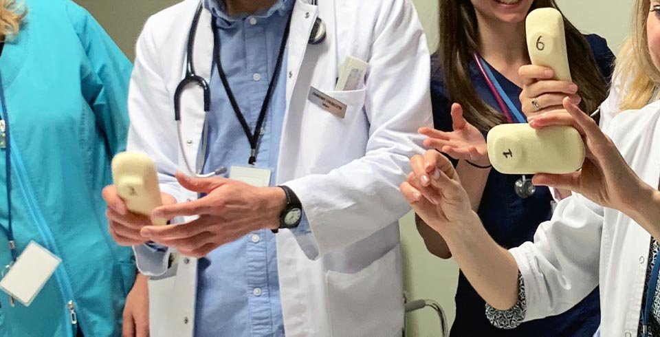
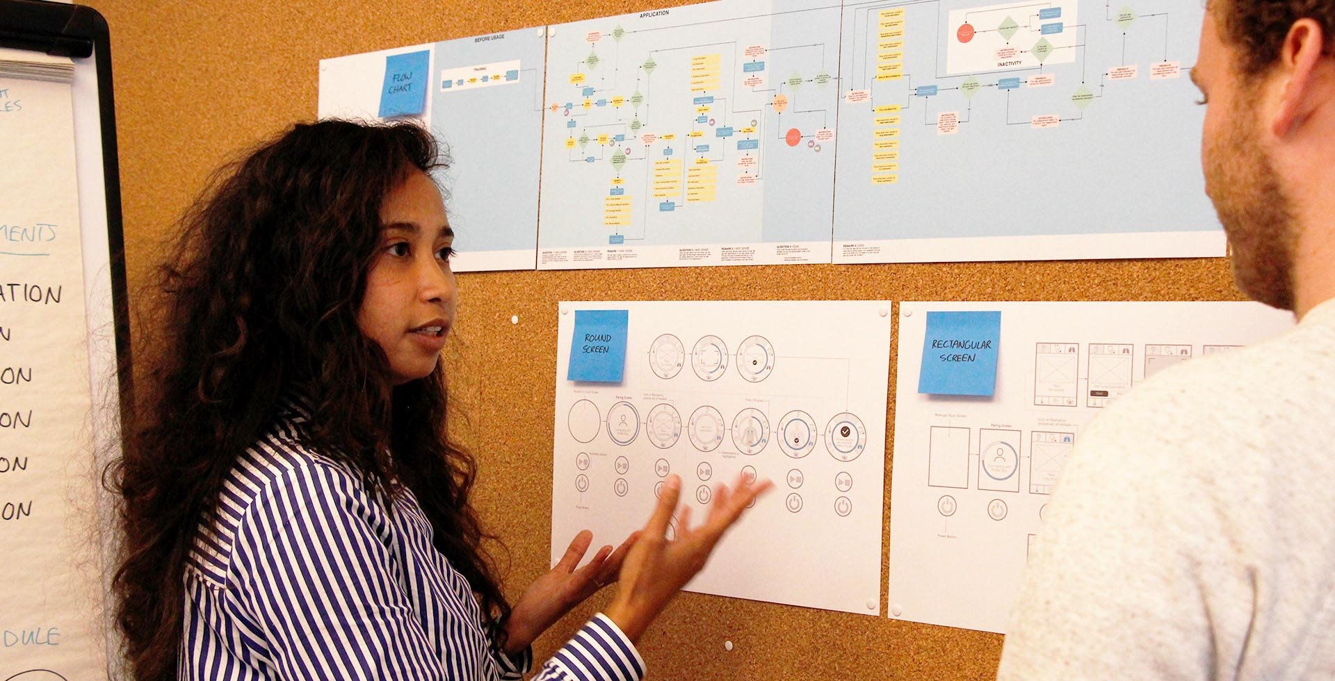
I worked closely together with Higo's team, doctors and focus groups to optimize each step of the user interface. In a very early stage, a paper prototype of the interface was made to test in combination with a mock-up of the device. The user interface elements should be easy to access. Several sizes and orientations of the screen were explored to find out what works best when holding the device in different positions.
Simple and intuitive
When developing the device, we took the opportunity to design it in such a way that it is able to detect certain things automatically. This way users aren't confused about whether they are doing anything right or wrong.
Every exam starts with an animated tutorial showing which module the user has to apply and how to connect it to the device. Once the right module is attached, another tutorial starts showing how to use the device for that specific exam. This consistent and clear use of tutorials across the different examinations makes the users familiar with the steps and helps them complete each task.
The animations and graphic design consist of simple illustrations with specific colours which ensure the user focuses on the most important elements. During the exam a progress bar shows up to inform the user about the status of the exam. Once the exam is completed, the data is collected in the user profile and is sent to the doctor.